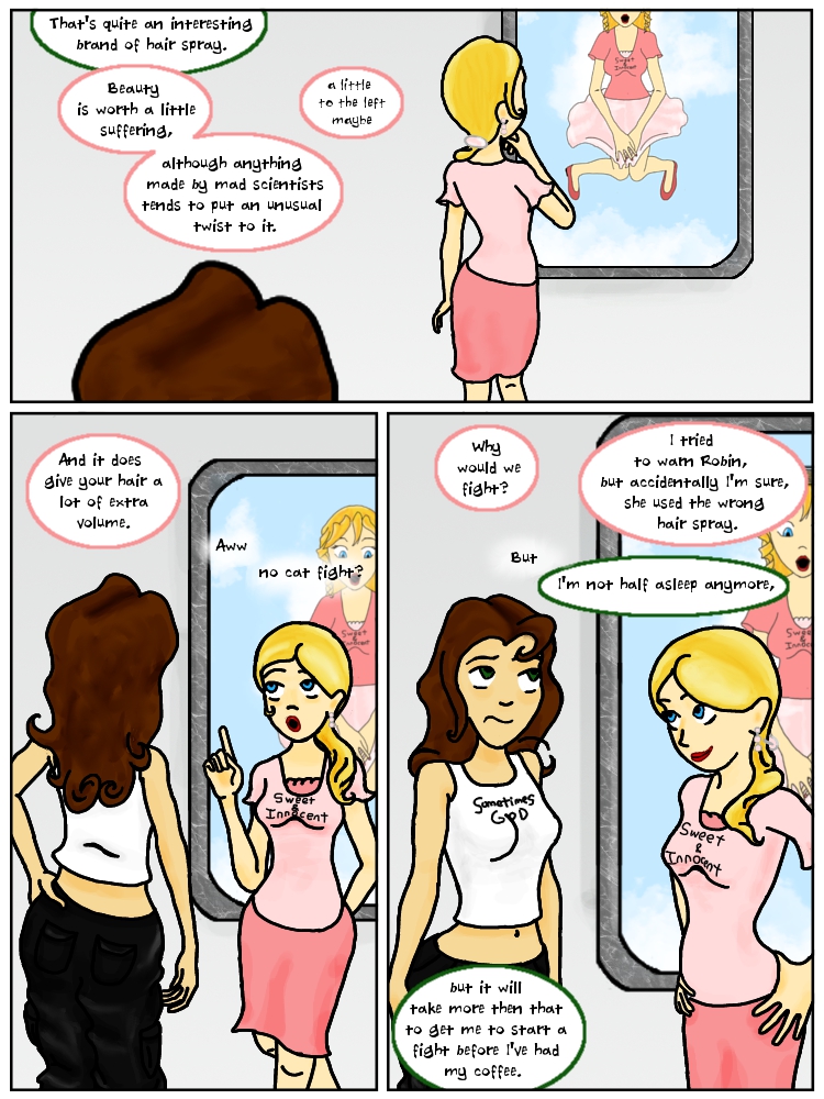
Page 125: That kind of volume
I’ll probably keep playing with the exact contours of Robin’s hair but I think I like the new look. I still have one more accessory I want to add but that will have to wait a bit till it comes up in the script. It will be before Robin gets her coffee though.


Hi,
I am currently going through your comics as I saw it recently, I have noticed a small mistake here and there.
I am pointing them out mostly just to try and help you. Not trying to be rude at all.
I have noticed one thing though, when you have a word ending in rn you don’t leave much of a gap and it makes it look like an m and it may make it difficult for some people to see. You are great though.
Here at least that is the fault of the font I was using back then. Now I’ve made my own font based on my hand writing made legible and adapted to word bubble style (although not full all caps print comic style). Once I get some free time I plan on tweaking the font I made to fix some things I don’t like about it so feed back on the lettering in the newest pages would be appreciated. I already know I want to thicken up the lines and redesign a few letters, as well as see what I can do about the kerning of specific letters. The biggest thing I would like feedback on, lettering wise, is font size. I’m never quite sure what size is easily readable for others. I don’t want to make reading the comic hard, but space is also at a premium, and covering up any more of the art than necessary is regrettable and can even cause layout issues.