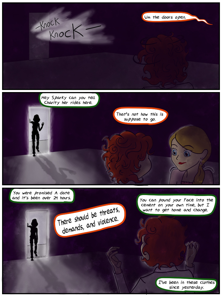
Page 215: It’s all about the entrance
I rather like the art in this one. there isn’t a lot of things going on but I like how the textures turned out and the depth added by the foreground/background. And not having to color in every last detail on Robin was a plus too.


Shouldn’t she be casting a shadow?
Probably though the light in the hallway isn’t all that bright or directed its just that there is almost no light in Sparky’s room. If it bugs me enough and i have time i’ll see what kind of a fix i can do without tons of effort.
OK. Thanks. Sorry for nitpicking. I love the comic, and the artwork on that strip is so good it took me several times before I even wondered about that. Guess I’m just over thinking things.
Shadows added. I kept them faint since I don’t want them drawing attention from the descriptive bits that are more relevant to the story